
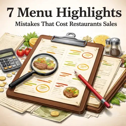
Menu Highlights Key Takeaways
A well-designed menu does more than list dishes — it guides diners toward profitable choices.
- Ignoring visual hierarchy is the biggest menu highlights mistake — customers scan, they don’t read.
- Overpricing your best items pushes diners toward low-margin choices, hurting profitability.
- Small layout tweaks, like using boxes and icons, can increase sales of selected items by up to 30%.
Why Most Restaurant Menu Highlights Fail to Drive Sales
A well-designed menu does more than list dishes — it guides diners toward profitable choices. When done right, your menu highlights act as visual anchors that capture attention and increase average check size. The problem? Most menus are designed for the owner’s taste, not the customer’s scanning behavior.
Research from the menu engineering world shows that 80% of menu profits come from just 20% of the items. That minority deserves special treatment. Yet many restaurants bury their best-margin dishes in a sea of text, tiny fonts, and cluttered categories. The result: customers gravitate toward safe, familiar choices that may not benefit your bottom line.
Let’s walk through seven specific mistakes and how to turn each one around. The fixes are simple, but the impact on your revenue can be dramatic.
Mistake 1: No Visual Hierarchy in Your Menu Highlights
Diners scan a menu in about 109 seconds. They first look to the center-right, then drift to the top. If nothing catches their eye, they fall back on default items — often the cheapest or most familiar. Without a clear visual hierarchy, your best menu items look just like everything else.
The fix: Use gaze-motion patterns
Place your highest-margin items in the “golden triangle” — the upper-right quadrant of the page. Use subtle design signals like a box, a bold font, or a small icon (a star or chef’s hat) to flag these dishes. Studies by the Menu Engineering Institute show that items inside a box sell 27% more often than items in plain text.
Real-world example
A steakhouse in Dallas moved its 45-day dry-aged ribeye into a bordered box with a small “Chef’s Favorite” tag. Sales of that cut jumped 34% in six weeks. No price change — just better visual prominence.
Mistake 2: Highlighting the Wrong Items Altogether
Many menus feature popular dishes that have thin profit margins. While those items drive foot traffic, they shouldn’t be your primary menu highlights. The goal is to push high-profit items, not just high-volume ones.
The fix: Focus on “stars” and “plowhorses”
In menu engineering terms, you want to highlight items that are both popular AND profitable (stars). You also want to boost plowhorses — high-profit items that just need more visibility. Use your menu highlights to reposition these dishes into the spotlight.
| Item Category | Popularity | Profit Margin | Highlight Strategy |
|---|---|---|---|
| Stars | High | High | Strong visual + price anchor |
| Plowhorses | Low | High | Move to “golden triangle” + icon |
| Puzzles | High | Low | Reprice or reduce portion size |
| Dogs | Low | Low | Remove or redesign entirely |
Mistake 3: Cluttered Layouts That Overwhelm Diners
When too many items compete for attention, nothing stands out. A menu with 50+ dishes crammed into small text forces diners to skim, often missing your best menu highlights. This is especially common in family-style and fast-casual concepts.
The fix: Embrace white space
Limit the number of items to a manageable range — research suggests 7 to 15 items per category is ideal. Use white space generously around your highlighted dishes. Add subtle separators (thin lines or shaded bands) to group items logically without overwhelming the eye.
Practical tip
Test a “clean” version of your menu on just two items: your highest-margin appetizer and your most profitable main course. If you see an uptick in sales after four weeks, roll out the cleaner layout to the rest of the menu.
Mistake 4: Using Vague or Generic Descriptions
“Grilled chicken breast served with vegetables” doesn’t sell. That sentence could describe half the dishes on a typical menu. When your best menu items have generic blurbs, customers have no reason to order them over a competitor’s version.
The fix: Write sensory, benefit-driven copy
Instead of listing ingredients, paint a picture. Use words that trigger taste, smell, and texture: “crispy,” “butter-basted,” “slow-roasted,” “zesty.” Mention cooking methods (wood-fired, sous-vide, hand-cut) because they imply quality. Include a short origin story if it fits — “house-made pasta from a 1950s family recipe” adds perceived value.
Before and after
Before: “Grilled salmon with asparagus and lemon butter.”
After: “Line-caught Atlantic salmon, wood-grilled to a smoky char, served with crisp-tender asparagus and a house-churned lemon beurre blanc.”
Mistake 5: Misplaced Pricing That Hurts Perceived Value
Many operators place dollar signs or price columns next to every item. This trains customers to shop by price rather than value. Your menu highlights — the items you want to sell most — get evaluated purely on cost instead of experience.
The fix: Use subtle pricing signals
Remove dollar signs. Right-align prices without a column header. End prices with a .95 or .00 depending on your brand (round numbers feel premium). For your top highlights, consider a “market price” note or a short explanation of what makes the dish special before showing the price.
Psychological trick
List your most expensive item first in each category. This sets a high anchor, making everything that follows feel more reasonable. A $45 steak makes a $28 pasta look like a bargain — even if the pasta is your target highlight.
Mistake 6: Static Menu Highlights That Never Change
If your menu looks exactly the same month after month, regulars stop noticing it. Stale menu highlights lose their power over time. Diners develop “menu blindness” — they skip over items they’ve seen a dozen times without a second glance.
The fix: Rotate and refresh seasonally
Update your highlighted items at least four times a year. Introduce seasonal ingredients (peak tomatoes in summer, root vegetables in fall) and tie your best menu items to local events or holidays. You don’t need to change the entire menu — just shift the visual emphasis to new stars.
Quick win
Add a “Seasonal Special” section with two rotating items. Use a different background shade or border. This keeps your menu feeling alive and gives regulars a reason to look carefully at every visit.
Mistake 7: Ignoring Mobile and Digital Menu Formats
With the rise of QR-code menus and online ordering, many restaurants still design menu highlights for a full-page print layout — and then shrink it onto a phone screen. Details become unreadable, and your highlighted items get lost.
The fix: Test every version on a smartphone
Build your digital menu with the same attention to hierarchy you use for print. Use large headings, clean categorisation, and high-contrast images. Make sure your highlights are visible without zooming. Consider a “Most Popular” or “Server’s Pick” badge that works equally well on a small screen.
Mobile optimisations that work
- Use a single-column layout rather than multiple columns.
- Add tap-to-expand descriptions for signature dishes.
- Place your best menu highlights in the top third of the digital screen.
- Test both light and dark mode readability.
How to Audit Your Own Menu Highlights in 30 Minutes
You don’t need a consultant to find these errors. Print your current menu, grab a red pen, and run through this checklist:
- Circle your three highest-margin items. Are they visually distinct? If not, that’s mistake #1.
- Ask a friend to scan the menu for 15 seconds. Do they point to those same three items? If not, your hierarchy needs work.
- Count the items per category. If any category has more than 20 items, you have a clutter problem (#3).
- Read each description aloud. Would it tempt you to order? If it sounds generic, rewrite it (#4).
- Check the pricing. Are your target items at least 15% above the cheapest option? Adjust accordingly (#5).
- Look at the date on your menu. Older than six months? Schedule a refresh (#6).
- Pull up your digital menu on a phone. Is it legible without zooming? If not, fix the mobile layout (#7).
Useful Resources
For deeper reading on menu engineering and design best practices, check these two excellent sources:
- FSR Magazine: The Science of Menu Engineering — A comprehensive guide to menu design psychology with real-world case studies from leading restaurant chains.
- National Restaurant Association: Menu Design Research — Data-driven insights on how menu layout influences ordering behaviour, updated annually.
Menu highlights are not a decoration — they are a direct lever for profitability. By avoiding these seven mistakes, you turn your menu from a simple list of dishes into a strategic sales tool that works for you every single hour your restaurant is open. Start with one fix this week, measure the result, and build from there. Your bottom line will thank you.
Frequently Asked Questions About Menu Highlights
What are menu highlights ?
Menu highlights are the specific dishes or sections that receive extra visual or typographic emphasis on a menu — such as boxes, bold fonts, icons, or special positions — intended to draw diners’ attention and increase orders of those items.
Why are menu highlights important for sales?
They guide customers toward high-profit or signature dishes, reducing choice paralysis and increasing average check size. Properly placed highlights can boost sales of selected items by 15-30% according to industry studies.
How many menu highlights should I have?
Limit to 3-5 per menu page. Too many highlights create clutter and reduce each one’s impact. Focus on your “star” items — those that are both highly popular and highly profitable.
Where should I place my menu highlights on the page?
The optimal position is the upper-right quadrant (the “golden triangle”). The next best spots are the center-right and the top-center of the page. Avoid placing highlights in the bottom-left quadrant whenever possible.
Should I use photos for menu highlights ?
High-quality professional photos can increase orders of a featured dish by up to 30%, but avoid using photos for more than 20% of your items. Overusing photos cheapens the menu and overwhelms the layout.
What is the biggest mistake when choosing menu highlights ?
Highlighting items that are popular but low-margin — like a cheap pasta or a loss-leader burger. The goal is to drive profitability, not just volume. Always check your food cost percentages before deciding which items to feature.
How often should I update my menu highlights ?
Ideally every season (quarterly). Regular updates keep the menu fresh for repeat customers and allow you to shift emphasis based on ingredient availability, food cost changes, and sales data.
Can I use the same highlights on digital and print menus?
Yes, but the visual execution must differ. On digital menus, ensure text is large enough to read without zooming, and use single-column layouts. What works on an A4 print may be invisible on a smartphone screen.
Do icons like stars or chef hats really work?
Yes. A simple icon next to a dish can increase orders by 15-20%. The key is using them sparingly — only for true menu highlights. Overuse dilutes the signal and reduces trust.
Should I list the price before or after the description?
For highlighted items, place the price after the description (or at the far right). This lets the sensory copy and visual appeal build value before the customer sees the cost. Removing dollar signs also helps shift focus from price to experience.
What kind of font works best for menu highlights ?
Use a bold or slightly larger version of your menu’s heading font. Avoid script or decorative fonts for highlights — they reduce legibility. Sans-serif fonts (like Helvetica or Proxima Nova) work well for modern concepts, while serif fonts suit fine dining.
How many items should be on a menu page to keep highlights effective?
Keep each page to 12-18 items maximum. Overcrowding reduces the impact of any single highlight. More than 20 items per page leads to decision fatigue and lower sales of your featured dishes.
Can I highlight an item without using a box or icon?
Yes. Use varied typography (bold, italic, larger size) or generous white space around the item. You can also use a different text color or a subtle background tint. The goal is visual contrast, not necessarily a box.
What is the “golden triangle” on a menu?
It refers to the upper-right quadrant of a single-page menu. Eye-tracking studies show that the average diner’s eyes land there first, making it the most valuable real estate for menu highlights.
How do I test if my menu highlights are working?
Run a simple A/B test: keep your current menu for two weeks and track sales of the highlighted items. Then implement one of the fixes from this article and measure for another two weeks. A 10%+ increase indicates your new highlights are more effective.
Should I highlight vegetarian or vegan items?
If your concept has a plant-based signature dish with good margins, absolutely. Many diners actively scan for these options. Highlighting them with a “V” or leaf icon signals inclusivity and can attract a wider customer base.
What if my menu is handed out by servers — does placement still matter?
Yes. Even when handed, the menu’s layout shapes the first 30 seconds of browsing. Verbal suggestions from staff amplify visual highlights. Menus that visually support the server’s recommendations see much higher conversion rates.
Can I highlight daily specials on a separate insert?
Yes — a separate insert or clip-on card works well for rotating highlights. Use a different paper color or size so it stands out from the main menu. Keep the insert brief: two or three items maximum.
Should menu highlights be the same for lunch and dinner?
No. Lunch customers are often more price-sensitive and time-pressed. Highlight faster, lower-priced items at lunch. Dinner guests are looking for a full experience — emphasise your signature, higher-margin dishes during evening service.
What is the single cheapest way to improve my menu highlights right now?
Remove the dollar signs and add a short, sensory description to your top two profit items. That costs nothing except a few minutes of editing time and can have an immediate impact on how diners perceive value.